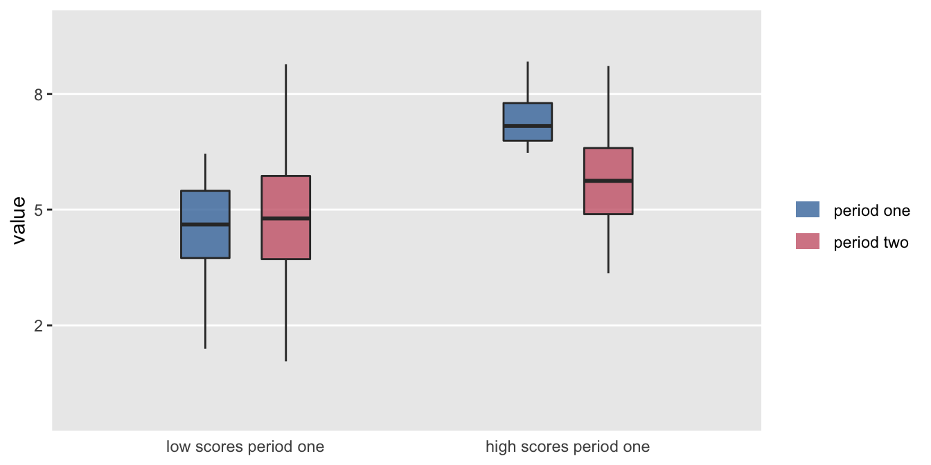
It is always exciting to find an interesting pattern in the data that seems to point to some important difference or relationship. A while ago, one of my colleagues shared a figure with me that looked something like this:

It looks like something is going on. On average low scorers in the first period increased a bit in the second period, and high scorers decreased a bit. Something is going on, but nothing specific to the data in question; it is just probability working its magic.
What my colleague had shown me is a classic example of regression to the mean. In the hope of clarifying the issue, I created a little simulation for her to show I could recreate this scenario with arbitrary data. And now I share it with you.
What is regression to the mean?
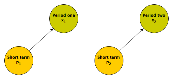
A simple picture may clarify what underlies regression to the mean. An individual’s measured responses over time are a function of various factors. In this first scenario, the responses are driven entirely by short term factors:

Responses in the two different time periods depend only on proximal causes. These could include an individual’s mood (which changes over time) or maybe something unrelated to the individual that would induce measurement error. (If the short term factor is not measured, this what is typically considered random noise or maybe “error”; I prefer to refer to this quantity as something like unexplained variation or individual level effects.) When these are the only factors influencing the responses, we would expect the responses in each period to be uncorrelated.
Regression to the mean manifests itself when we focus on sub-groups at extreme ends of the distribution. Here, we consider a sub-group of individuals with high levels of response in the first period. Since factors that led to these high values will not necessarily be present in the second period, we would expect the distribution of values for the sub-group in the second period to look like the distribution in the full sample (including high, moderate, and low responders) from the first period. Alternatively, if we think about the second period alone, we would expect the high value sub-group (from the first period) to look just like the rest of the sample. Either way we look at it, the sub-group mean in the second period will necessarily be lower than the mean of that same sub-group in the first period.
A simulation might clarify this. and are the short term factors influencing the period one outcome and period two outcome , respectively. The indicator if the period one response falls in the top of responses:
d <- defData(varname = "p1", formula = 0, variance = 1, dist = "normal")
d <- defData(d, varname = "p2", formula = 0, variance = 1, dist = "normal")
d <- defData(d, varname = "x1", formula = "0 + p1", dist = "nonrandom")
d <- defData(d, varname = "x2", formula = "0 + p2", dist = "nonrandom")
d <- defData(d, varname = "h1", formula = "x1 > quantile(x1, .80) ",
dist = "nonrandom")set.seed(2371)
dd <- genData(1000, d)The average (and sd) for the full sample in period one and period two are pretty much the same:
dd[, .(mu.x1 = mean(x1), sd.x1 = sd(x1),
mu.x2 = mean(x2), sd.x2 = sd(x2))]## mu.x1 sd.x1 mu.x2 sd.x2
## 1: 0.02 1 -0.07 1The mean of the sub-group of the sample who scored in the top 20% in period one is obviously higher than the full sample period one average since this is how we defined the sub-group. However, the period two distribution for this sub-group looks like the overall sample in period two. Again, this is due to the fact that the distribution of is the same for the period one high scoring sub-group and everyone else:
cbind(dd[h1 == TRUE, .(muh.x1 = mean(x1), sdh.x1 = sd(x1),
muh.x2 = mean(x2), sdh.x2 = sd(x2))],
dd[, .(mu.x2 = mean(x2), sd.x2 = sd(x2))])## muh.x1 sdh.x1 muh.x2 sdh.x2 mu.x2 sd.x2
## 1: 1 0.5 -0.08 1 -0.07 1A more realistic scenario
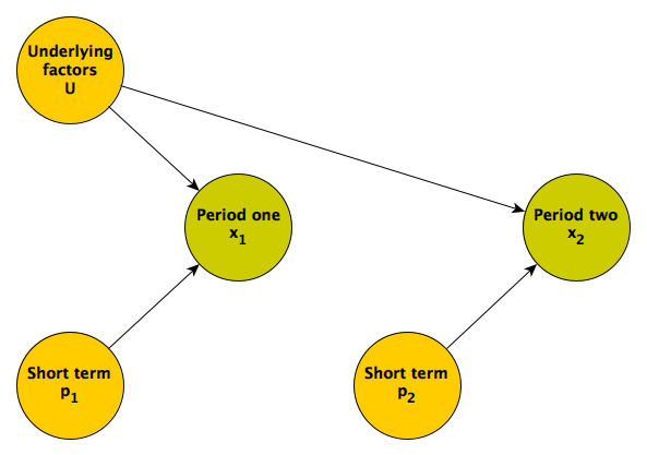
It is unlikely that the repeated measures and will be uncorrelated, and more plausible that they share some common factor or factors; someone who tends to score high in the first may tend to score high in the second. For example, an individual’s underlying health status could influence outcomes over both measurement periods. Here is the updated DAG:

Regression to the mean is really a phenomenon driven by the relative strength of the longer term underlying factors and shorter term proximal factors. If the underlying factors dominate the more proximal ones, then the we would expect to see less regression to the mean. (In the extreme case where there no proximal factors, only longer term, underlying ones, there will be no regression to the mean.)
Back to the simulation. (This time and are reflected in the variance of the two responses, so they do not appear explicitly in the data definitions.)
library(parallel)
d <- defData(varname = "U", formula = "-1;1", dist = "uniform")
d <- defData(d, varname = "x1", formula = "0 + 2*U", variance = 1)
d <- defData(d, varname = "x2", formula = "0 + 2*U", variance = 1)
d <- defData(d, varname = "h1", formula = "x1 > quantile(x1, .80) ",
dist = "nonrandom")
set.seed(2371)
dd <- genData(1000, d)When we look at the means of the period one high scoring sub-group in periods one and two, it appears that there is at least some regression to the mean, but it is not absolute, because the underlying factors have a fairly strong effect on the responses in both periods:
##    muh.x1 sdh.x1 muh.x2 sdh.x2 mu.x2 sd.x2
## 1:      2    0.6      1      1 -0.02     1
Regression to the mean under different scenarios
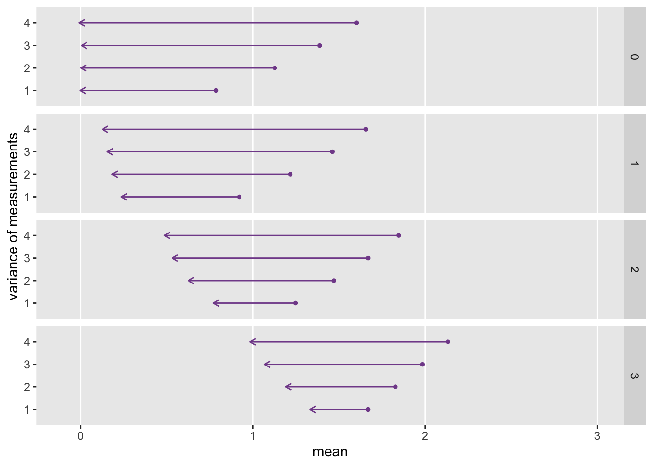
To conclude, I want to illustrate how the relative strength of , , and affect the regression to the mean. (The code to generate the plot immediately follows.) Under each simulation scenario I generated 1000 data sets of 200 individuals each, and averaged across the 1000 replications to show the mean and measurements for the high scorers only in period one. In all cases, period one scores are to the right and the arrow points to the period two scores. The longer the arrow, the more extensive the regression to the mean.

As the effect of grows (moving down from box to box in the plot), regression to the mean decreases. And within each box, as we decrease the strength of the proximal factors (by decreasing the variance of the and ), regression to the mean also decreases.
Addendum: code to generate replications and plot
rtomean <- function(n, d) {
  dd <- genData(n, d)
  data.table(x1 = dd[x1 >= h1, mean(x1)] , x2 = dd[x1 >= h1, mean(x2)])
}

repl <- function(xvar, nrep, ucoef, d) {

  d <- updateDef(d, "x1", newvariance = xvar)
  d <- updateDef(d, "x2", newvariance = xvar)

  dif <- rbindlist(mclapply(1:nrep, function(x) rtomean(200, d)))
  mudif <- unlist(lapply(dif, mean))
  data.table(ucoef, xvar, x1 = mudif[1], x2 = mudif[2])

}

dres <- list()
i <- 0

for (ucoef in c(0, 1, 2, 3)) {

  i <- i + 1

  uform <- genFormula( c(0, ucoef), "U")

  d <- updateDef(d, "x1", newformula = uform)
  d <- updateDef(d, "x2", newformula = uform)

  dr <- mclapply(seq(1, 4, by = 1), function(x) repl(x, 1000, ucoef, d))
  dres[[i]] <- rbindlist(dr)
}

dres <- rbindlist(dres)

ggplot(data = dres, aes(x = x1, xend = x2, y = xvar, yend = xvar)) +
  geom_point(aes(x=x1, y = xvar), color = "#824D99", size = 1) +
  geom_segment(arrow = arrow(length = unit(.175, "cm")),
                color = "#824D99") +
  scale_y_continuous(limits = c(0.5, 4.5), breaks = 1:4,
                     name = "variance of measurements") +
  scale_x_continuous(limits = c(-0.1, 3), name = "mean") +
  facet_grid(ucoef ~ .) +
  theme(panel.grid.minor = element_blank(),
        panel.grid.major.y = element_blank())