An economist contacted me about the ability of simstudy to generate correlated ordinal categorical outcomes. He is trying to generate data as an aide to teaching cost-effectiveness analysis, and is hoping to simulate responses to a quality-of-life survey instrument, the EQ-5D. The particular instrument has five questions related to mobility, self-care, activities, pain, and anxiety. Each item has three possible responses: (1) no problems, (2) some problems, and (3) a lot of problems. Although the instrument has been designed so that each item is orthogonal (independent) from the others, it is impossible to avoid correlation. So, in generating (and analyzing) these kinds of data, it is important to take this into consideration.
I had recently added functions to generate correlated data from non-normal distributions, and I had also created a function that generates ordinal categorical outcomes, but there was nothing to address the data generation problem he had in mind. After a little back forth, I came up with some code that will hopefully address his needs. And I hope the new function genCorOrdCat is general enough to support other data generation needs as well. (For the moment, this version is only available for download from the github site, but will be on CRAN sometime soon.)
General approach
The data generation algorithm assumes an underlying latent process logistic process that I’ve described earlier. In the context of a set of multivariate responses, there is a latent process for each of the responses. For a single response, we can randomly select a value from the logistic distribution and determine the response region in which this values falls to assign the randomly generated response. To generate correlated responses, we generate correlated values from the logistic distribution using a standard normal copula-like approach, just as I did to generate multivariate data from non-normal distributions.
The new function genCorOrdCat requires specification of the baseline probabilities for each of the items in matrix form. The function also provides an argument to incorporate covariates, much like its univariate counterpart genOrdCat does. The correlation is specified either with a single correlation coefficient and a correlation structure (“independence”, “compound symmetry”, or “AR-1”) or by specifying the correlation matrix directly.
Examples
In the following examples, I assume four items each with four possible responses - which is different from the EQ-5D.
High correlation
In the first simulation items two and three share the same uniform distribution, and items one and four each have their own distribution:
baseprobs <- matrix(c(0.10, 0.20, 0.30, 0.40,
                      0.25, 0.25, 0.25, 0.25,
                      0.25, 0.25, 0.25, 0.25,
                      0.40, 0.30, 0.20, 0.10),
             nrow = 4, byrow = TRUE)

# generate the data

set.seed(3333)
dT <- genData(100000)
dX <- genCorOrdCat(dT, adjVar = NULL, baseprobs = baseprobs,
                   prefix = "q", rho = 0.8, corstr = "cs")

dX
## id q1 q2 q3 q4
## 1: 1 2 1 1 1
## 2: 2 1 1 1 1
## 3: 3 2 2 1 1
## 4: 4 3 3 3 2
## 5: 5 4 2 3 1
## ---
## 99996: 99996 3 4 4 3
## 99997: 99997 2 1 1 2
## 99998: 99998 2 2 2 2
## 99999: 99999 3 1 1 1
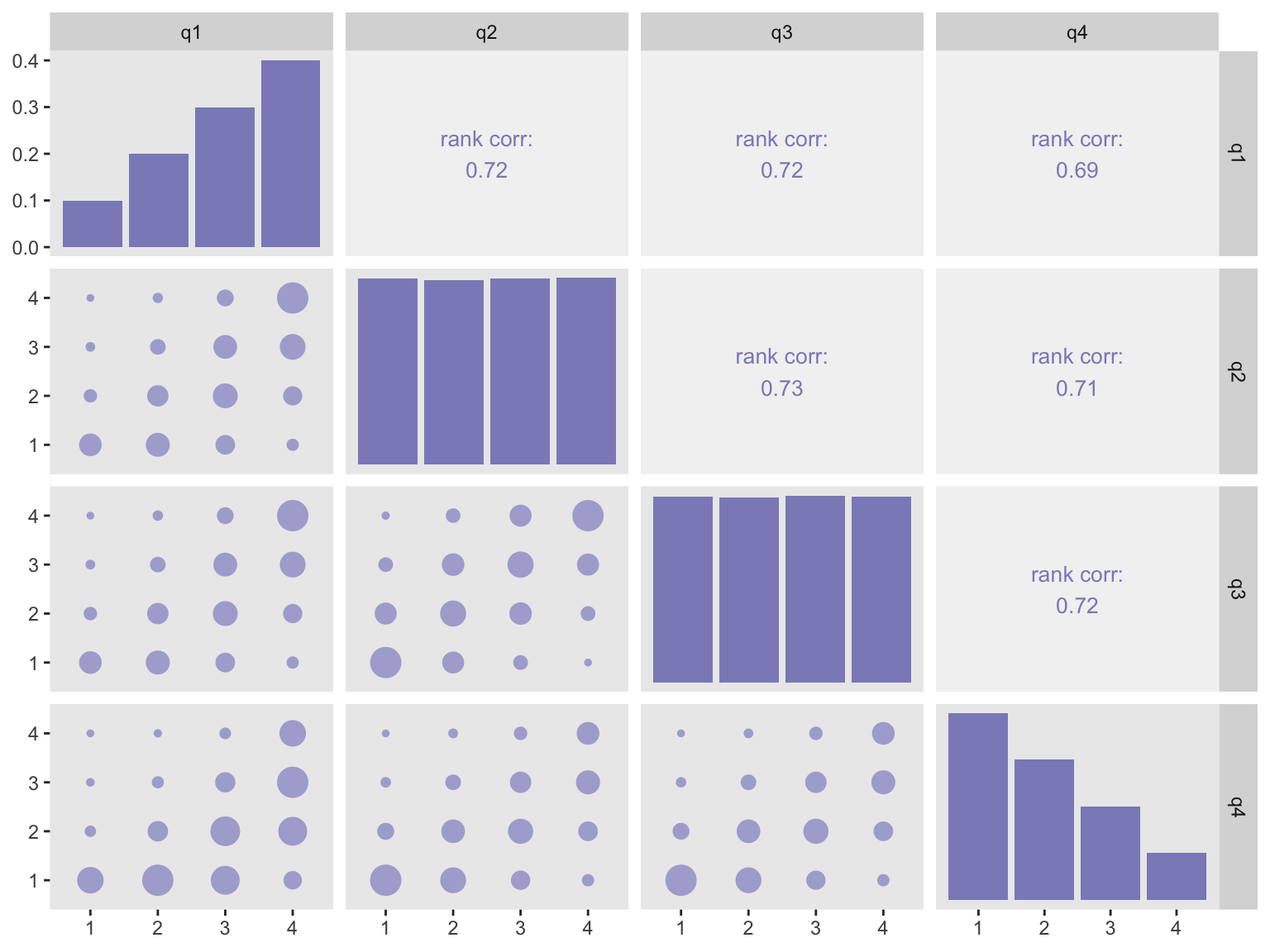
## 100000: 100000 4 4 4 4Here is a correlation plot that tries to help us visualize what high correlation looks like under this context. (The plots are generated using function ggpairs from the package GGally. Details of the plot are provided in the addendum.) In the plot, the size of the circles represents the frequency of observations with a particular combination; the larger the circle, the more times we observe a combination. The correlation that is reported is the estimated Spearman’s Rho, which is appropriate for ordered or ranked data.
If you look at the plot in the third row and second column of this first example, the observations are mostly located near the diagonal - strong evidence of high correlation.

Low correlation
dX <- genCorOrdCat(dT, adjVar = NULL, baseprobs = baseprobs,
                   prefix = "q", rho = 0.05, corstr = "cs")
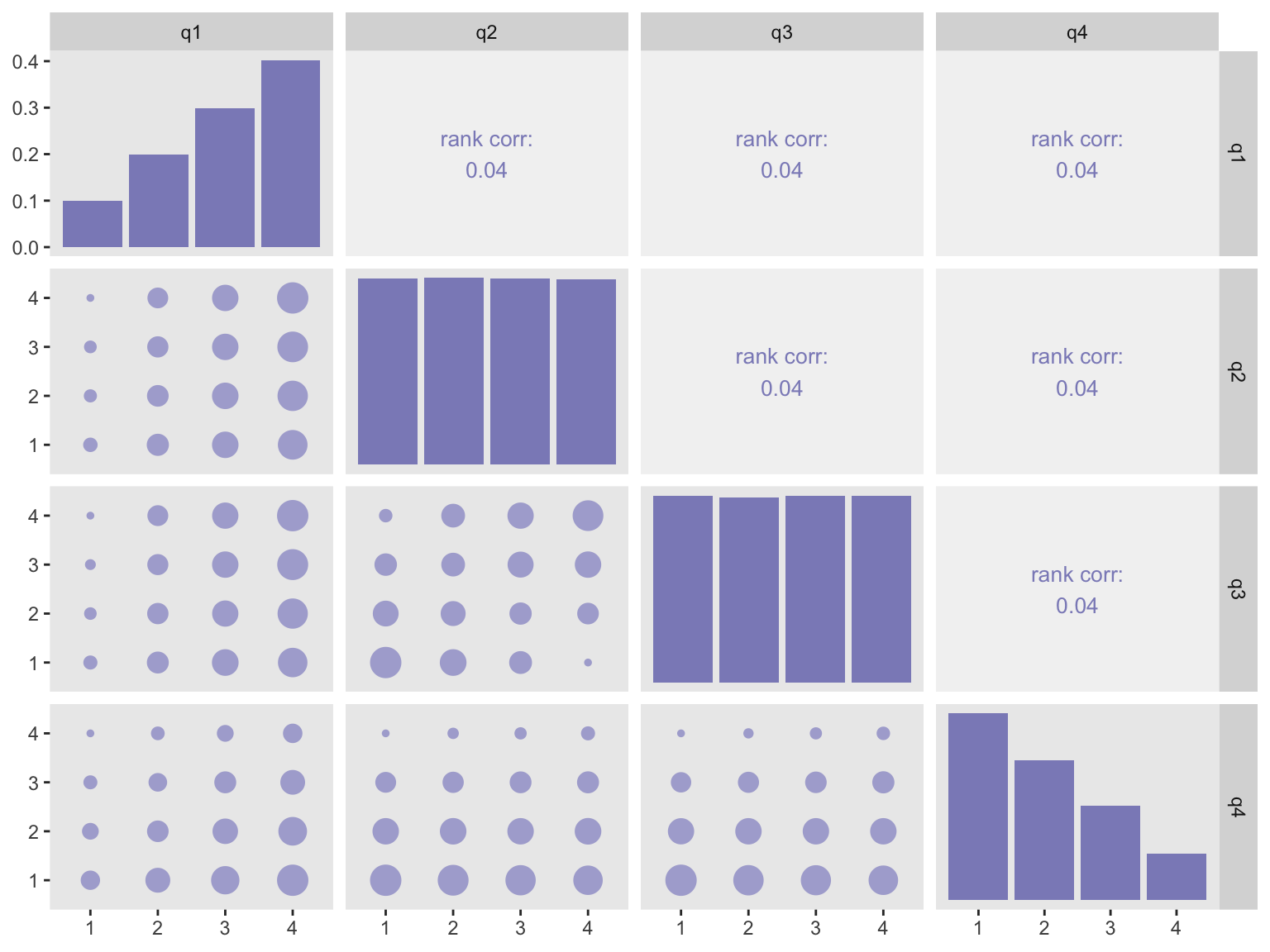
In this second example with very little correlation, the clustering around the diagonal in the third row/second column is less pronounced.

Same distribution
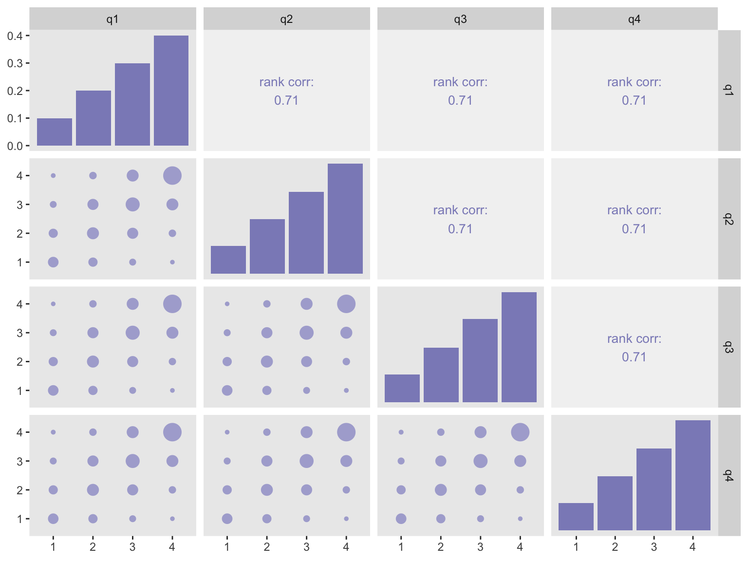
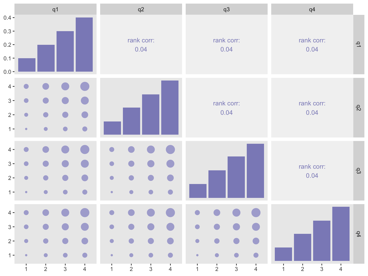
I leave you with two plots that are based on responses that share the same distributions:
baseprobs <- matrix(c(0.1, 0.2, 0.3, 0.4,
                      0.1, 0.2, 0.3, 0.4,
                      0.1, 0.2, 0.3, 0.4,
                      0.1, 0.2, 0.3, 0.4),
             nrow = 4, byrow = TRUE)
High correlation

Low correlation

Addendum
In case you are interested in seeing how I generated the correlation plots, here is the code:
library(GGally)

mycor <- function(data, mapping, sgnf=3, size = 8, ...) {

  xCol <- as.character(mapping[[1]][[2]])
  yCol <- as.character(mapping[[2]][[2]])

  xVal <- data[[xCol]]
  yVal <- data[[yCol]]

  rho <- Hmisc::rcorr(xVal, yVal, type = "spearman")$r[2,1]
  loc <- data.table(x=.5, y=.5)

  p <-  ggplot(data = loc, aes(x = x, y = y)) +
    xlim(0:1) +
    ylim(0:1) +
    theme(panel.background = element_rect(fill = "grey95"),
          panel.grid = element_blank()) +
    labs(x = NULL, y = NULL) +
    geom_text(size = size, color = "#8c8cc2",
     label =
       paste("rank corr:\n", round(rho, sgnf), sep = "", collapse = ""))
  p
}

my_lower <- function(data, mapping, ...){

  xCol <- as.character(mapping[[1]][[2]])
  yCol <- as.character(mapping[[2]][[2]])
  dx <- data.table(data)[ , c(xCol, yCol), with = FALSE]
  ds <- dx[, .N,
    keyby = .(eval(parse(text=xCol)), eval(parse(text=yCol)))]
  setnames(ds, c("parse", "parse.1"), c(xCol, yCol))

  p <- ggplot(data = ds, mapping = mapping) +
    geom_point(aes(size = N), color = "#adadd4") +
    scale_x_continuous(expand = c(.2, 0)) +
    scale_y_continuous(expand = c(.2, 0)) +
    theme(panel.grid = element_blank())
  p
}

my_diag <- function(data, mapping, ...){
  p <- ggplot(data = data, mapping = mapping) +
    geom_bar(aes(y = (..count..)/sum(..count..)), fill = "#8c8cc2") +
    theme(panel.grid = element_blank())
  p
}

ggpairs(dX[, -"id"], lower = list(continuous = my_lower),
        diag = list(continuous = my_diag),
        upper = list(continuous = wrap(mycor, sgnf = 2, size = 3.5)))