I’ve been inspired by two recent talks describing the challenges of using instrumental variable (IV) methods. IV methods are used to estimate the causal effects of an exposure or intervention when there is unmeasured confounding. This estimated causal effect is very specific: the complier average causal effect (CACE). But, the CACE is just one of several possible causal estimands that we might be interested in. For example, there’s the average causal effect (ACE) that represents a population average (not just based the subset of compliers). Or there’s the average causal effect for the exposed or treated (ACT) that allows for the fact that the exposed could be different from the unexposed.
I thought it would be illuminating to analyze a single data set using different causal inference methods, including IV as well as propensity score matching and inverse probability weighting. Each of these methods targets different causal estimands, which may or may not be equivalent depending on the subgroup-level causal effects and underlying population distribution of those subgroups.
This is the first of a two-part post. In this first part, I am focusing entirely on the data generation process (DGP). In the follow-up, I will get to the model estimation.
Underlying assumptions of the DGP
Since the motivation here is instrumental variable analysis, it seems natural that the data generation process include a possible instrument. (Once again, I am going to refer to elsewhere in case you want more details on the theory and estimation of IV models. Here is an excellent in-depth tutorial by Baiocchi et al that provides great background. I’ve even touched on the topic of CACE in an earlier series of posts. Certainly, there is no lack of discussion on this topic, as a quick search around the internet will make readily obvious.)
The figure below is a variation on the directed acyclic graph (DAG) that is often very useful in laying out causal assumptions of a DGP. This particular figure is a type of SWIG: single world intervention graph. SWIGs, developed by Robins and Richardson, fuse the worlds of potential outcomes and DAGs.
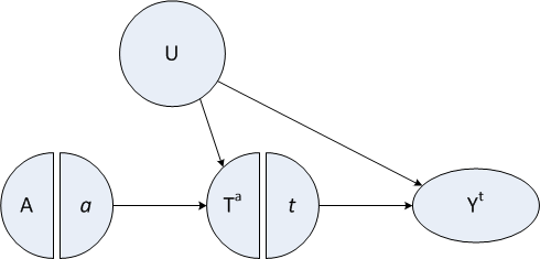
Important things to note here:
There is an instrumental variable \(A\) that has a direct causal relationship only to the exposure of interest, \(T\). If the exposure is a particular medical intervention, think of the instrument as some kind of encouragement to get that treatment. Some people get the encouragement, others don’t - though on average folks who are encouraged are no different from folks who are not (at least not in ways that relate to the outcome.)
There is a confounder \(U\), possibly unmeasured, that is related both to potential outcomes and the exposure, but not to the encouragement (the instrument)! In the example below, we conceive of \(U\) as an underlying health status.
Exposure variable \(T\) (that, in this case, is binary, just to keep things simpler) indicates whether a person gets the treatment or not.
Each individual will have two potential treatments \(T^0\) and \(T^1\), where \(T^0\) is the treatment when there is no encouragement (i.e. A = 0), and \(T^1\) is the treatment when \(A = 1\). For any individual, we actually only observe one of these treatments (depending on the actual value of \(A\). The population of interest consists of always-takers, compliers, and never-takers. Never-takers always reject the treatment regardless of whether or not they get encouragement - that is, \(T^0 = T^1 = 0\). Compliers only seek out the treatment when they are encouraged, otherwise they don’t: \(T^0 = 0\) and \(T^1 = 1\). And always-takers always (of course) seek out the treatment: \(T^0 = T^1 = 1\). (In order for the model to be identifiable, we need to make a not-so-crazy assumption that there are no so-called deniers, where \(T^0 = 1\) and \(T^1 = 0\).) An individual may have a different complier status depending on the instrument and exposure (i.e., one person might be a never-taker in one scenario but a complier in another). In this simulation, larger values of the confounder \(U\) will increase \(P(T^a = 1)\) for both \(a \in (0,1)\).
Each individual will have two potential outcomes, only one of which is observed. \(Y_i^0\) is the outcome for person \(i\) when they are unexposed or do not receive the treatment. \(Y_i^1\) is the outcome for that same person when they are exposed or do receive the treatment. In this case, the confounder \(U\) can affect the potential outcomes. (This diagram is technically a SWIT, which is template, since I have generically referred to the potential treatment \(T^a\) and potential outcome \(Y^t\).)
Not shown in this diagram are the observed \(T_i\) and \(Y_i\); we assume that \(T_i = (T_i^a | A = a)\) and \(Y_i = (Y_i^t | T = t)\)
Also not shown on the graph is the causal estimand of an exposure for individual \(i\), which can be defined as \(CE_i \equiv Y^1_i - Y^0_i\). We can calculate the average causal effect, \(E[CE]\), for the sample as a whole as well as for subgroups.
DGP for potential outcomes
The workhorse of this data generating process is a logistic sigmoid function that represents the mean potential outcome \(Y^t\) at each value of \(u\). This allows us to easily generate homogeneous or heterogeneous causal effects. The function has four parameters, \(M\), \(\gamma\), \(\delta\), and \(\alpha\):
\[ Y^t = f(u) = M/[1 + exp(-\gamma(u - \delta))] + \alpha, \] where \(M\) is the maximum of the function (assuming the minimum is \(0\)), \(\gamma\) is the steepness of the curve, \(\delta\) is the inflection point of the curve, and \(\alpha\) is a vertical shift of the entire curve. This function is easily implemented in R:
fYt <- function(x, max, grad, inflect = 0, offset = 0) {
  ( max / (1 + exp( -grad * (x - inflect) ) ) ) + offset
}
Here is a single curve based on an arbitrary set of parameters:
ggplot(data = data.frame(x = 0), mapping = aes(x = x)) +
  stat_function(fun = fYt,  size = 2,
    args = list(max = 1.5, grad = 5, inflect = 0.2)) +
  xlim(-1.5, 1.5)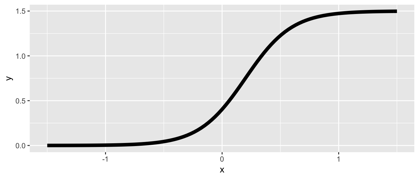
The figures below show the mean of the potential outcomes \(Y^0\) and \(Y^1\) under two different scenarios. On the left, the causal effect at each level of \(u\) is constant, and on the right, the causal effect changes over the different values of \(u\), increasing rapidly when \(0 < u < 0.2\).
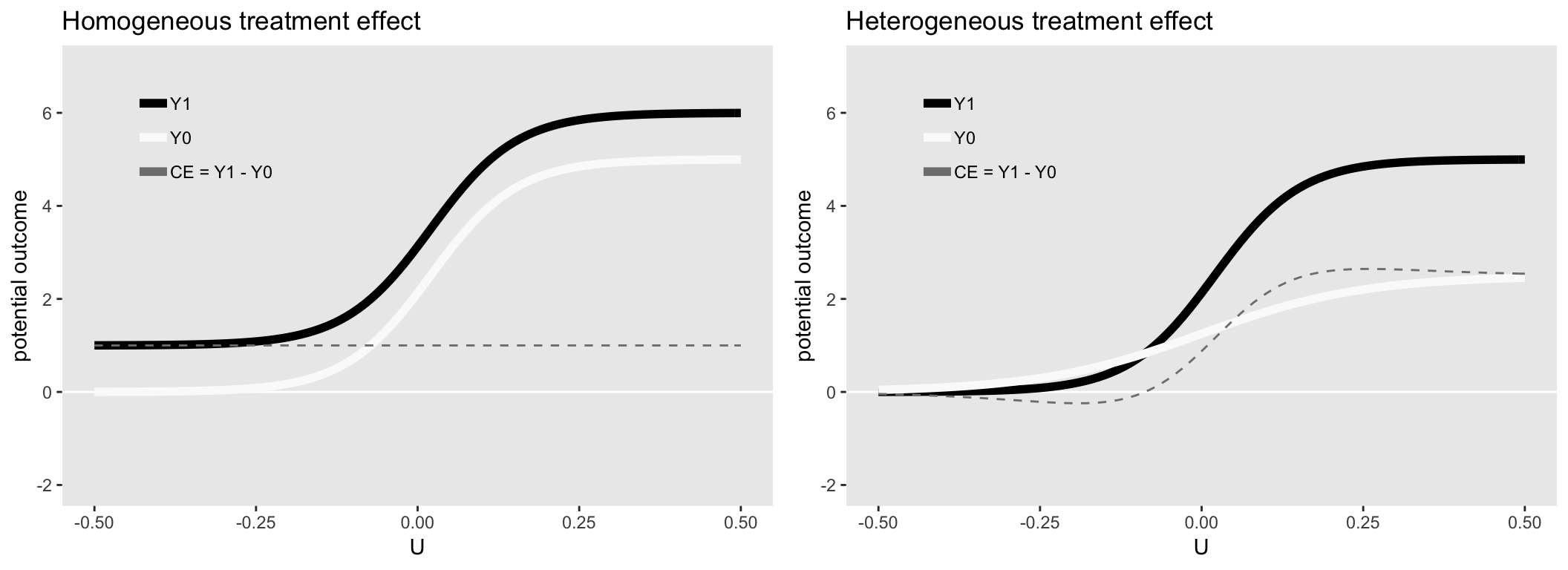
Homogeneous causal effect
Here’s a closer look at the the different causal effects under the first scenario of homogeneous causal effects across values of \(u\) by generating some data. The data definitions are provided in three steps. In the first step, the confounder \(U\) is generated. Think of this as health status, which can take on values ranging from \(-0.5\) to \(0.5\), where lower scores indicate worse health.
Next up are the definitions of the potential outcomes of treatment and outcome, both of which are dependent on the unmeasured confounder.
(Though technically not a definition step, the instrument assignment (variable \(A\)) is generated later using trtAssign.)
In the final steps, we generate the observed treatment \(T\) (a function of both \(A\) and complier status \(S\)), and observed outcome \(Y\) (which is determined by \(T\)). A complier status is determined based on the potential outcomes of treatment.
library(simstudy)

### Potential treatments U and outcomes Y

def <- defData(varname = "U", formula = "-0.5;0.5",
               dist = "uniform")
def <- defData(def, varname = "T0",
               formula = "-2 + 4 * U",
               dist = "binary", link = "logit")
def <- defData(def, varname = "T1x",
               formula = "4 * U ",
               dist = "binary", link = "logit")

# This prevents any deniers:

def <- defData(def, varname = "T1",
               formula = "(T0 == 0) * T1x + (T0 == 1) * 1",
               dist = "nonrandom")

def <- defData(def, varname = "Y0",
               formula = "fYt(U, 5, 15, 0.02)",
               variance = 0.25)
def <- defData(def, varname = "Y1",
               formula = "fYt(U, 5.0, 15, 0.02, 1)",
               variance = 0.25)

### Observed treatments

defA <- defDataAdd(varname = "T",
                   formula = "(A == 0) * T0 + (A == 1) * T1")
defA <- defDataAdd(defA, varname = "Y",
                   formula = "(T == 0) * Y0 + (T == 1) * Y1",
                   dist = "nonrandom")
defA <- defDataAdd(defA, varname = "Y.r",
                   formula = "(A == 0) * Y0 + (A == 1) * Y1",
                   dist = "nonrandom")

### Complier status

defC <- defCondition(condition = "T0 == 0 & T1 == 0", formula = 1,
                     dist = "nonrandom")
defC <- defCondition(defC, condition = "T0 == 0 & T1 == 1", formula = 2,
                     dist = "nonrandom")
defC <- defCondition(defC, condition = "T0 == 1 & T1 == 1", formula = 3,
                     dist = "nonrandom")
Once all the definitions are set, it is quite simple to generate the data:
set.seed(383726)

# Step 1 - generate U and potential outcomes for T and Y

dx <- genData(500, def)

# Step 2 - randomly assign instrument

dx <- trtAssign(dx, nTrt = 2, grpName = "A" )

# Step 3 - generate observed T and Y

dx <- addColumns(defA, dx)

# Step 4 - determine complier status

dx <- addCondition(defC, dx, "S")
dx <- genFactor(dx, "S", labels = c("Never", "Complier", "Always"))
Looking at the data
Here are a few records from the generated dataset:
dx## id S A U T0 T1x T1 Y0 Y1 T Y Y.r fS
## 1: 1 1 1 0.282 0 0 0 5.5636 6.01 0 5.5636 6.01 Never
## 2: 2 3 0 0.405 1 1 1 4.5534 5.83 1 5.8301 4.55 Always
## 3: 3 3 1 0.487 1 1 1 6.0098 5.82 1 5.8196 5.82 Always
## 4: 4 2 1 0.498 0 1 1 5.2695 6.43 1 6.4276 6.43 Complier
## 5: 5 1 1 -0.486 0 0 0 0.0088 1.02 0 0.0088 1.02 Never
## ---
## 496: 496 3 0 -0.180 1 0 1 0.8384 1.10 1 1.0966 0.84 Always
## 497: 497 3 1 0.154 1 1 1 4.9118 5.46 1 5.4585 5.46 Always
## 498: 498 1 1 0.333 0 0 0 5.4800 5.46 0 5.4800 5.46 Never
## 499: 499 1 1 0.049 0 0 0 3.4075 5.15 0 3.4075 5.15 Never
## 500: 500 1 1 -0.159 0 0 0 0.4278 0.96 0 0.4278 0.96 NeverThe various average causal effects, starting with the (marginal) average causal effect and ending with the average causal effect for those treated are all close to \(1\):
ACE <- dx[, mean(Y1 - Y0)]
AACE <- dx[fS == "Always", mean(Y1 - Y0)]
CACE <- dx[fS == "Complier", mean(Y1 - Y0)]
NACE <- dx[fS == "Never", mean(Y1 - Y0)]
ACT <- dx[T == 1, mean(Y1 - Y0)]
## ceType ce
## 1: ACE 0.97
## 2: AACE 0.96
## 3: CACE 1.00
## 4: NACE 0.96
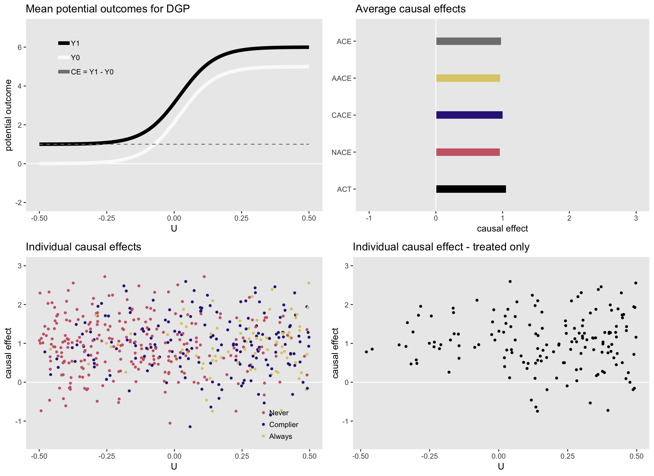
## 5: ACT 1.05Here is a visual summary of the generated data. The upper left shows the underlying data generating functions for the potential outcomes and the upper right plot shows the various average causal effects: average causal effect for the population (ACE), average causal effect for always-takers (AACE), complier average causal effect (CACE), average causal effect for never-takers (NACE), and the average causal effect for the treated (ACT).
The true individual-specific causal effects color-coded based on complier status (that we could never observe in the real world, but we can here in simulation world) are on the bottom left, and the true individual causal effects for those who received treatment are on the bottom right. These figures are only remarkable in that all average causal effects and individual causal effects are close to \(1\), reflecting the homogeneous causal effect data generating process.
Heterogenous causal effect #1
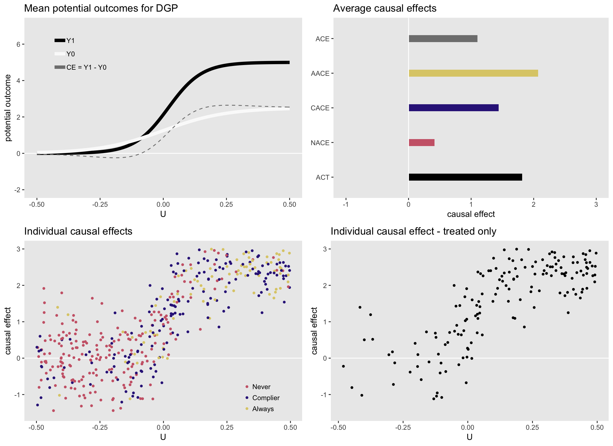
Here is a set of figures for a heterogeneous data generating process (which can be seen on the upper left). Now, the average causal effects are quite different from each other. In particular \(ACE < CACE < ACT\). Obviously, none of these quantities is wrong, they are just estimating the average effect for different groups of people that are characterized by different levels of health status \(U\):
Heterogenous causal effect #2
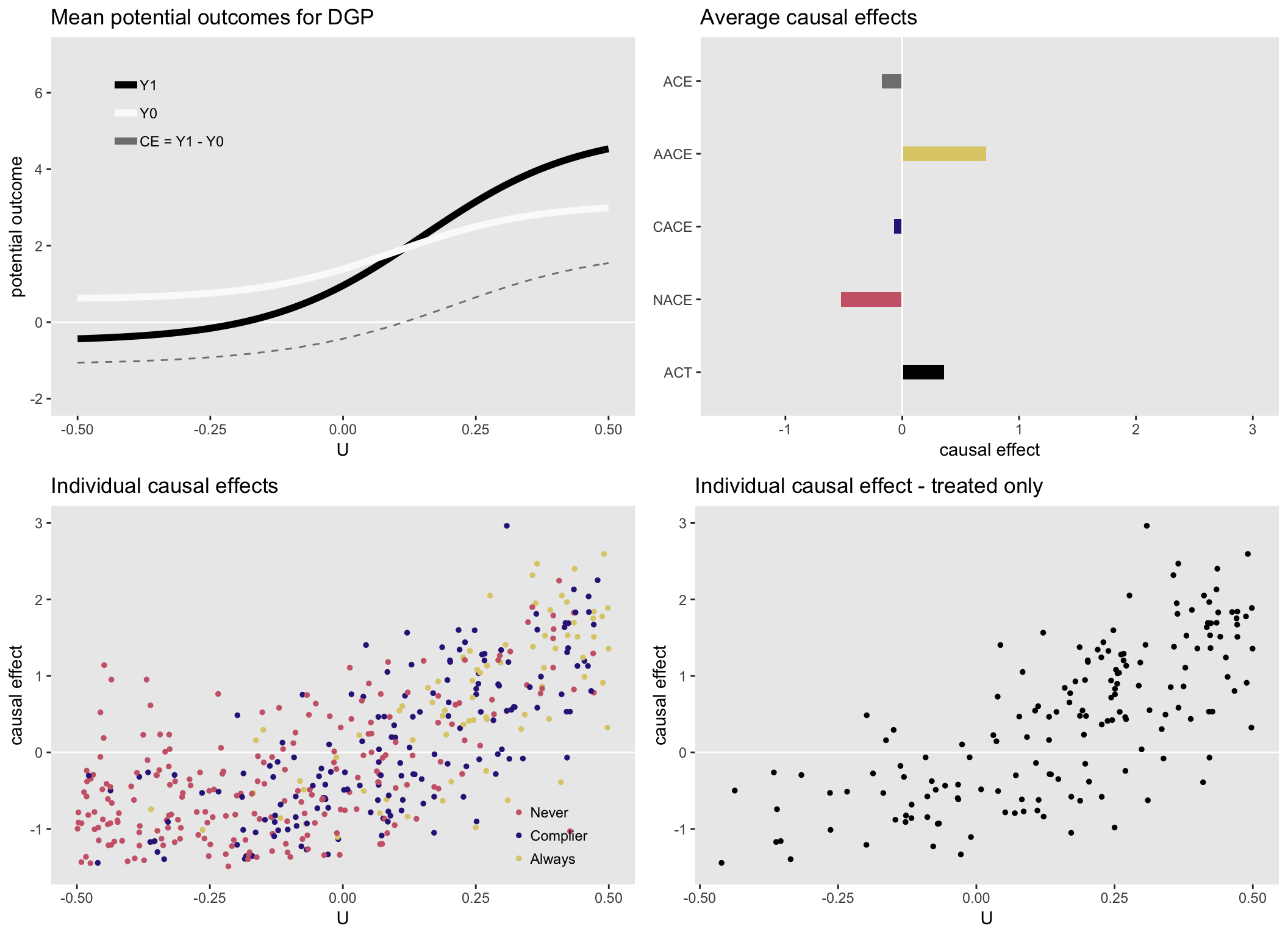
Finally, here is one more scenario, also with heterogeneous causal effects. In this case \(ACE \approx CACE\), but the other effects are quite different, actually with different signs.
Next up: estimating the causal effects
In the second part of this post, I will use this DGP and estimate these effects using various modeling techniques. It will hopefully become apparent that different modeling approaches provide estimates of different causal estimands.