The ROC (receiver operating characteristic) curve visually depicts the ability of a measure or classification model to distinguish two groups. The area under the ROC (AUC), quantifies the extent of that ability. My goal here is to describe as simply as possible a process that serves as a foundation for the ROC, and to provide an interpretation of the AUC that is defined by that curve.
A prediction problem
The classic application for the ROC is a medical test designed to identify individuals with a particular medical condition or disease. The population is comprised of two groups of individuals: those with the condition and those without. What we want is some sort of diagnostic tool (such as a blood test or diagnostic scan) that will identify which group a particular patient belongs to. The question is how well does that tool or measure help us distinguish between the two groups? The ROC (and AUC) is designed to help answer that question.
True and false predictions
While we might not know group membership for an individual, we assume that they do indeed belong to one of the two groups. When we base a prediction of group membership based on a test, we may or may not be right. There are four scenarios. It is possible that our prediction is (1) a true positive (the patient has the condition and that is what we predict), (2) a false positive (the patient does not have the condition, but we predict they do have it), (3) a false negative (the patient has the condition but we believe they are healthy), or (4) a true negative (the patient is healthy and that is our prediction.) A “good” test is one that maximizes true positive predictions while minimizing false positive predictions.
We can actually only assess the quality of the test if we know the true group membership of the individuals. So, our plan is to take measurements on this known sample, make predictions based on the test, and see how our predictions match up to reality. The ROC is one way to characterize how well our test matches up to reality.
Binary decision informed by a continuous measure
While we make a binary decision about group membership - either we think they have the condition or they do not - the underlying measure that is used to make that determination may be continuous, like a score. For example, a hypothetical test might return a score between -10 and 10. We can pick a threshold anywhere along the continuum that will form the basis of our prediction. For example, we might say that any score > 0 indicates the condition is present, otherwise it is not. This simple test will be useful as a tool to discriminate between the disease and non-disease groups if that threshold indeed distinguishes the groups.
This is probably best demonstrated with a simple simulation. The sample we will generate has 100 individuals, around 40% who have the condition in question. The average score for the non-disease group is set at -5, and the average score for the disease group is 5. Both have variance 3.5:
library(simstudy)

# define data

defx <- defData(varname = "condition", formula = .4, dist = "binary")
defx <- defData(defx, "x", formula = "-5 + 10*condition",
                variance = 3.5, dist = "normal")

# generate data

set.seed(1873)
dx <- genData(100, defx)
head(dx)
## id condition x
## 1: 1 0 -5.83
## 2: 2 1 4.66
## 3: 3 1 4.23
## 4: 4 0 -3.87
## 5: 5 1 1.78
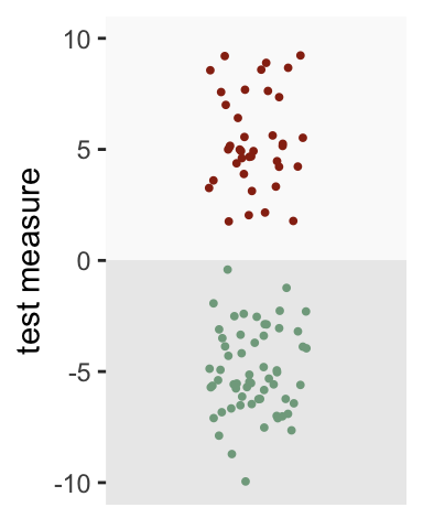
## 6: 6 0 -4.87Looking at the plot below, a threshold of zero appears to do an excellent job of distinguishing the groups. All of those with the condition (depicted in red) are above the threshold, whereas all of those without the condition (depicted in green) fall below the threshold:
The world is not always so neat and clean
Of course, we don’t usually have a measure or test that separates the groups so cleanly. Let’s say the average of the disease group is 2.5 and the non-disease group is -3. The threshold of zero still works pretty well, but it is not perfect. Some with the disease fall below the threshold (false negatives), and some without the disease lie above the threshold (false positives). In fact, only 87% of those with the disease are correctly identified (true positives), while 13% of those without the condition are incorrectly identified has having the disease (false positives).
defx <- updateDef(defx, changevar = "x", newformula="-3 + 5.5*condition",
                  newvariance = 6)
dx <- genData(100, defx)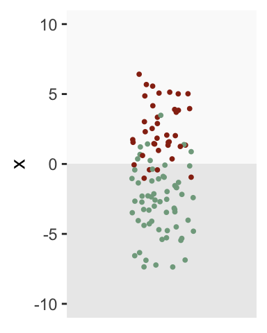
Generating the ROC
Zero isn’t the only possible threshold we could use for the diagnosis test. We can lower the threshold to below zero to ensure that we have 100% true positives, but we will have to sacrifice by increasing the proportion of false positives. Likewise, we could reduce the proportion of false positives by increasing the threshold above zero, but would reduce the proportion of true positives in the process.
There are, in fact, an infinite number of possible thresholds. Here is a sequence of plots of the same data with a number of different thresholds ranging from 8 to -8. The percent of true positives is shown on the top and the percent of false positives is shown on the bottom:
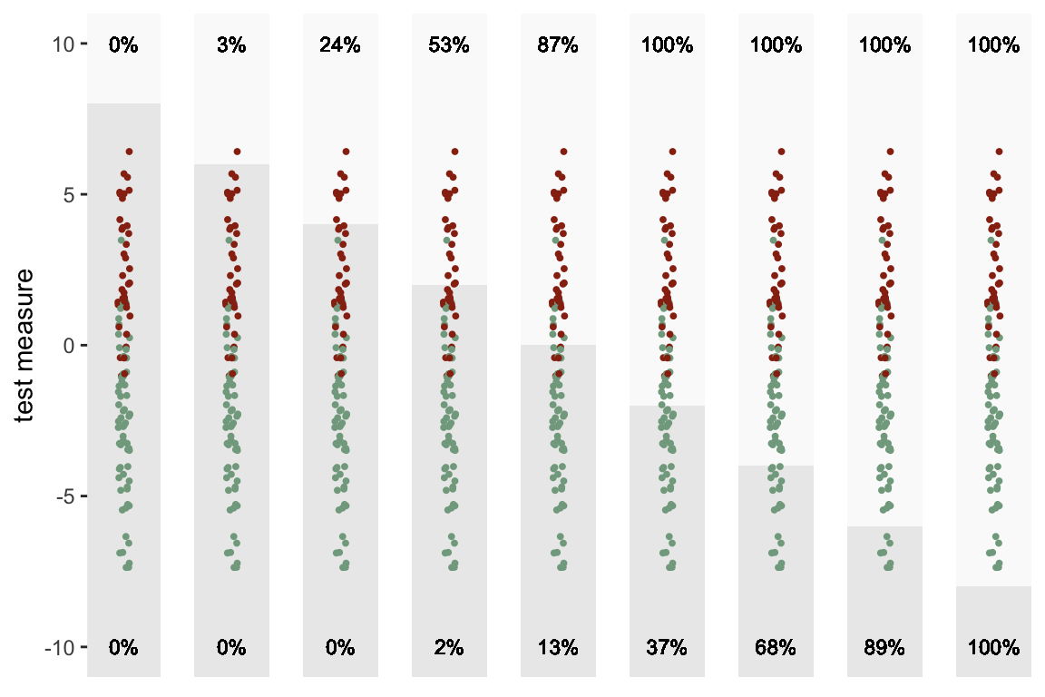
The ROC is really just a summarized version of this sequence of plots. The X-axis is the proportion of false positives at a particular threshold, and the Y-axis is the proportion of true positives. As we lower the threshold, we move from left to right. So, in the plot below, each point represents one of the sections above:
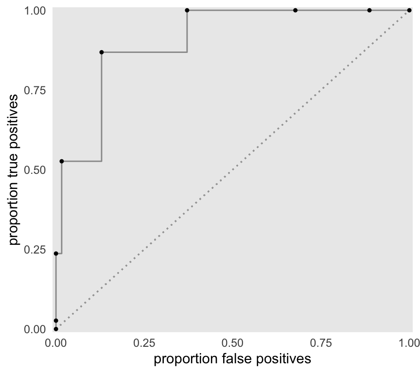
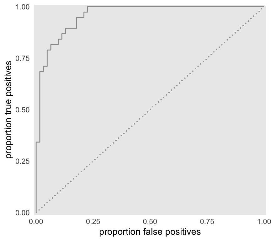
The ROC above is built from only 9 thresholds. If we consider all possible thresholds (continuous between -10 and 10), this is the the more complete curve:
Area under the ROC
The AUC is, well, the area under the ROC. The maximum AUC will be 1 when there is complete separation (there is an example of this below), and the minimum is 0.5 (depicted by the diagonal line) when there is no separation by the test measure (again, an example will follow). We can estimate this area by integrating an approximate function defined by the data between 0 and 1.
f <- approxfun(x = roc$false.pos, y=roc$true.pos)
integrate(f, lower = 0, upper = 1)
## 0.957 with absolute error < 0.00011There is actually a meaningful interpretation of the AUC, that is described in a classic 1982 paper by Hanley & McNeil (if you want a deeper understanding of the issues, this paper is not a bad place to start - there is, of course, a huge literature on the topic of ROCs). The AUC is actually equivalent to the probability that the test measure of a random draw from the diseased group will be greater than the test measure of a random draw from the healthy group. So, an AUC = 0.90 indicates that 90% of the time we draw a test measure from the disease group and non-disease group, the measure from the disease group will be greater.
Here is a simple function that returns a value of TRUE if the random draw from the disease group is greater:
randcomp <- function(ds) {
  ds[condition == 1, sample(x, 1)] > ds[condition == 0, sample(x, 1)]
}
And here is the proportion of 1000 draws where the measure from the disease group draws is greater (this is expected to be close to the AUC, which was estimated above to be 0.957):
mean(sapply(1:1000, function(x) randcomp(dx)))## [1] 0.958Of course, R has several packages that provide ROCs and calculate AUCs. I’m using package pROC here just to show you that my AUC estimate is not totally crazy:
library(pROC)
roc_obj <- roc(response = dx$condition, predictor = dx$x)
auc(roc_obj)
## Area under the curve: 0.958Alternative scenarios
As I indicated above, the AUC can generally range from 0.5 to 1.0. There is no hard and fast rule about what is a “good” AUC - it will depend on the application. Certainly, anything below 0.7 or maybe even 0.8 is pretty weak. I am going to conclude by generating data at the two extremes.
Minimal separation
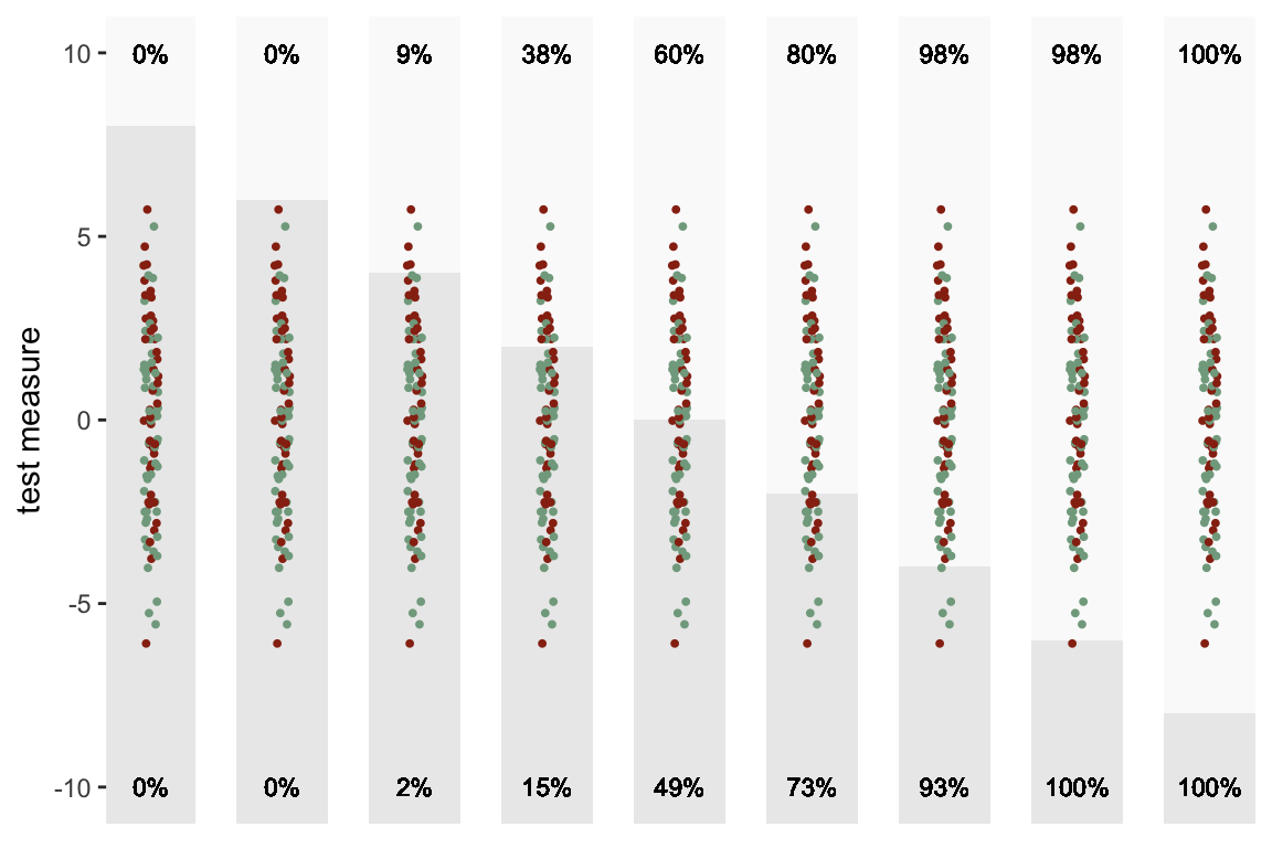
When the test measure for each group is equally distributed, there is unlikely to be any threshold for which the proportion of true positives exceeds the proportion of false positives. If this is the case, we should probably look for another test measure - or be prepared to make a lot of mistakes in the non-disease group.
defx <- updateDef(defx, changevar = "x", newformula="0+0*condition",
                  newvariance = 8)
dx <- genData(100, defx)
As we move the threshold lower, both the proportion of true positives and false positives steadily increase:
As a result, the ROC hangs fairly close to the diagonal lower bound.
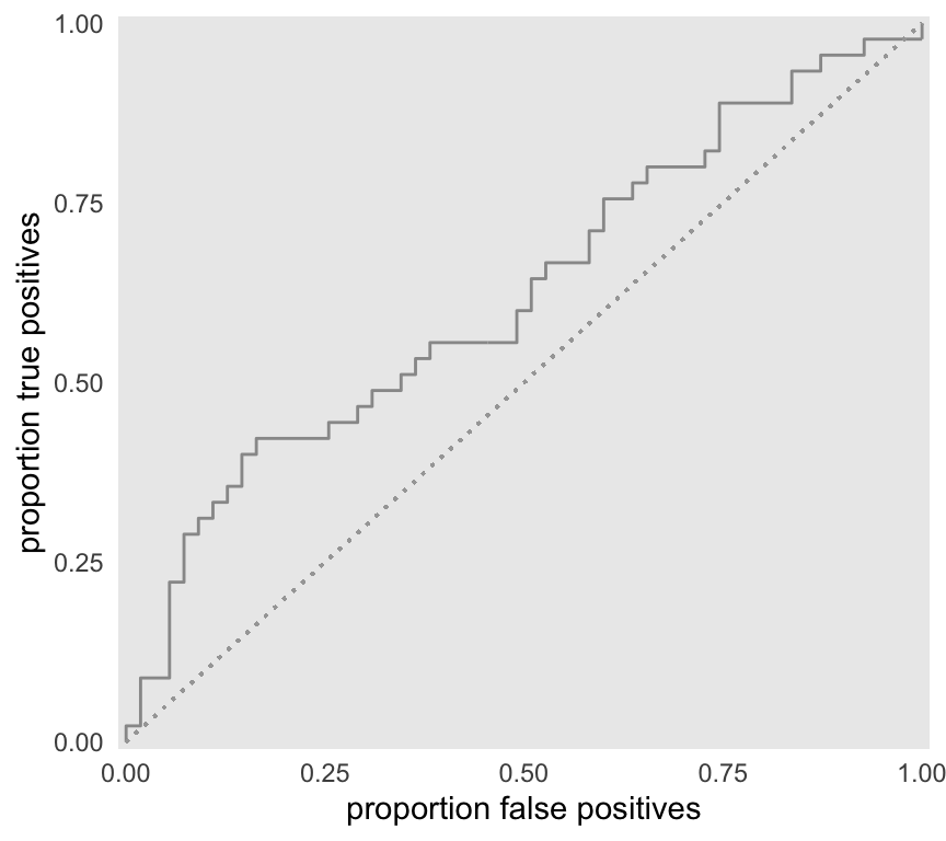
We would expect the AUC to be fairly close to 0.5, which it is:
f <- approxfun(x = roc$false.pos, y=roc$true.pos)
integrate(f, lower = 0, upper = 1)
## 0.623 with absolute error < 4.5e-05mean(sapply(1:1000, function(x) randcomp(dx)))## [1] 0.613Complete separation
At the other extreme, the mean of the disease group is high enough so that there is no overlap between the two groups. In this case, the curve follows along Y-axis before going across the X-axis. We can achieve 100% true positives and no false positives if threshold is set at some point that is below the minimum of the disease group, and above the maximum of the non-disease group. Zero will be the ideal cut-off point for this example.
defx <- updateDef(defx, changevar = "x", newformula="-4+8*condition",
                  newvariance = 3.5)
dx <- genData(100, defx)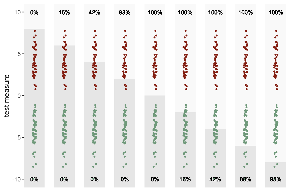
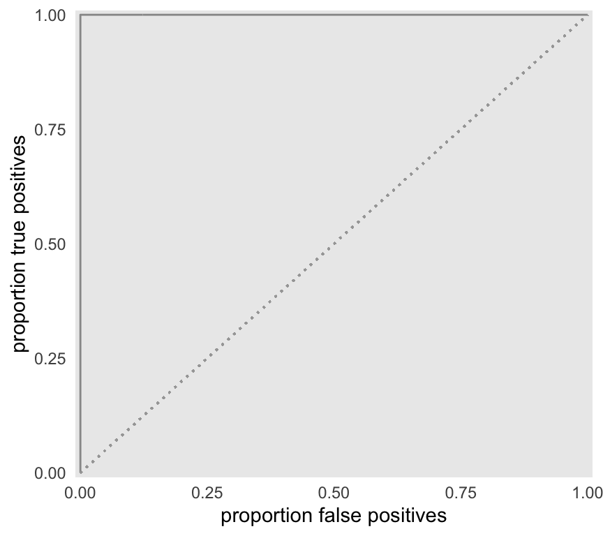
As expected the AUC is equal to 1:
f <- approxfun(x = roc$false.pos, y=roc$true.pos)
integrate(f, lower = 0, upper = 1)
## 0.996 with absolute error < 9.2e-05mean(sapply(1:1000, function(x) randcomp(dx)))## [1] 1Logistic regression and the ROC
Just a quick note to conclude. The ROC is often used in conjunction with classification problems based on logistic regression modeling. In this case, we may not have a single underlying test measure, but rather we may have multiple predictors or measures. In this case, group assignment decision needs to be based on a summary of these multiple measures; one logical candidate is the individual’s predicted probability estimated by model.
If the specified logistic regression model provides good separation between the two groups, the predicted probabilities will be quite different for each group (higher AUC). However, if the model is not a strong classifier, the predicted probabilities for the two groups will be much closer together (lower AUC).
References:
Hanley, J.A. and McNeil, B.J., 1982. The meaning and use of the area under a receiver operating characteristic (ROC) curve. Radiology, 143(1), pp.29-36.
Xavier Robin, Natacha Turck, Alexandre Hainard, Natalia Tiberti, Frédérique Lisacek, Jean-Charles Sanchez and Markus Müller (2011). pROC: an open-source package for R and S+ to analyze and compare ROC curves. BMC Bioinformatics, 12, p. 77. DOI: 10.1186/1471-2105-12-77.