Trying to simulate data with non-linear relationships can be frustrating, since there is not always an obvious mathematical expression that will give you the shape you are looking for. I’ve come up with a relatively simple solution for somewhat complex scenarios that only requires the specification of a few points that lie on or near the desired curve. (Clearly, if the relationships are straightforward, such as relationships that can easily be represented by quadratic or cubic polynomials, there is no need to go through all this trouble.) The translation from the set of points to the desired function and finally to the simulated data is done by leveraging generalized additive modelling (GAM) methods, and is described here.
Before we begin, here are the R packages used in the post:
library(data.table)
library(ggplot2)
library(mgcv)
Starting with the idea of non-linear function
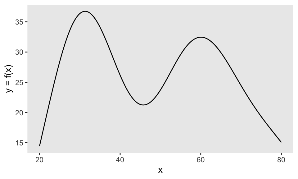
Say we desire a functional relationship \(y = f(x)\) that looks something like this:
Conceptualize the function with a handful of points
Since it is not obvious (to me at least) how to express this curve mathematically, let’s start by selecting a few points that describe the general shape. In this case, I think using seven points does the trick pretty well:
x <- c(20, 30, 40, 50, 60, 70, 80)
y <- c(15, 40, 25, 22, 35, 24, 15)

dd <- data.table(x = x, y = y)

ggplot(data = dd, aes(x = x, y = y)) +
  geom_line(lty = 2, color = "grey70") +
  geom_point() +
  theme(panel.grid = element_blank())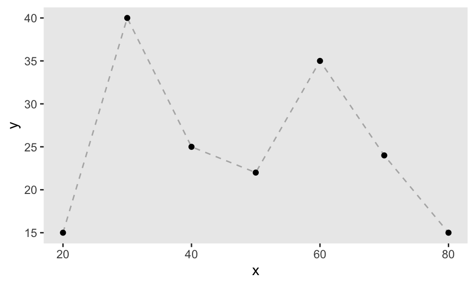
Fill in the gaps
If we want to extrapolate from this small set of points to a curve, we will need more data. We can easily generate this data by taking points along the lines that connect our original points. This requires only some rudimentary algebra. First, just create a data set that includes the start and end points of each line segment:
dc <- copy(dd)

dc[, xend := (shift(x, type = "lead"))]
dc[, yend := (shift(y, type = "lead"))]
dc <- dc[ -.N]
dc[, id := .I]

dc
## x y xend yend id
## 1: 20 15 30 40 1
## 2: 30 40 40 25 2
## 3: 40 25 50 22 3
## 4: 50 22 60 35 4
## 5: 60 35 70 24 5
## 6: 70 24 80 15 6And then after calculating the slope and intercept, you’ve got points along those line segments:
interp_line <- function(x, y, xend, yend) {
  slope <- (yend - y)/(xend - x)
  b <- y - slope*x
  newx <- seq(x, xend, length = 100)
  newy <- newx*slope + b

  data.table::data.table(x = newx, y = newy)
}

dx <- dc[, interp_line(x, y, xend, yend), keyby = id]
dx
## id x y
## 1: 1 20.00000 15.00000
## 2: 1 20.10101 15.25253
## 3: 1 20.20202 15.50505
## 4: 1 20.30303 15.75758
## 5: 1 20.40404 16.01010
## ---
## 596: 6 79.59596 15.36364
## 597: 6 79.69697 15.27273
## 598: 6 79.79798 15.18182
## 599: 6 79.89899 15.09091
## 600: 6 80.00000 15.00000The augmented set of points looks like a sequence of line segments when plotted:
ggplot(data = dx, aes(x = x, y = y)) +
  geom_point(size = .05) +
  theme(panel.grid = element_blank())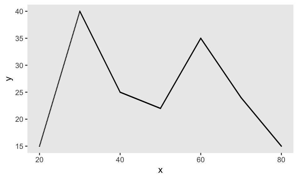
Smoothing out points to get our curve
The idea here is to convert this set of line segments into a curve that can be represented by a functional object we can use to generate new outcomes. Any model fit in R can serve as a functional object in the sense that if you provide an input (or number of inputs) to the predict function for that model fit, you will get an output from that model.
GAMs are a family of flexible models that use spline functions to generate highly curved functions, so are a perfect solution here. (There are many, many sources that describe GAMs: this and this provide excellent overviews, and of course, there is this book.) In this case, we will fit a GAM model to our augmented data set to get a smoothed version the desired function. A call to the function gam in the mgcv package with a smoothing term specified for our input \(x\) (and a relatively low degrees of freedom \(k\) to ensure a very smooth result), gives the object that will serve as our function:
gam.fit <- gam(y ~ s(x, k = 7), data = dx)Using predict.gam, we can see how the GAM has abstracted from the line segments to give us our desired curve. (Of course, we might need to tweak our input set of points to get closer to the curve we are looking for.)
dx[, ypred := predict(gam.fit)]

ggplot(data = dx, aes(x=x, y = ypred)) +
      geom_line()  +
      geom_point(data = dd, aes(x = x, y = y)) +
      theme(panel.grid = element_blank())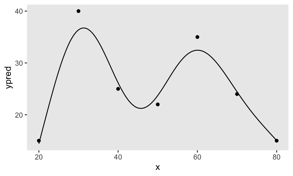
Generating the random data from this non-linear ‘function’
It is now easy to generate outcome data \(y\) that is centered around our function by generating random inputs (\(x\)’s), calling predict.gam, and adding some Gaussian noise:
set.seed(123)

rand_data <- data.table(x = runif(120, 20, 80))
rand_data$y <- predict(gam.fit, newdata = rand_data) + rnorm(nrow(rand_data),0, 2)

ggplot(data = rand_data, aes(x = x, y = y)) +
  geom_point(size = 1)  +
  theme(panel.grid = element_blank())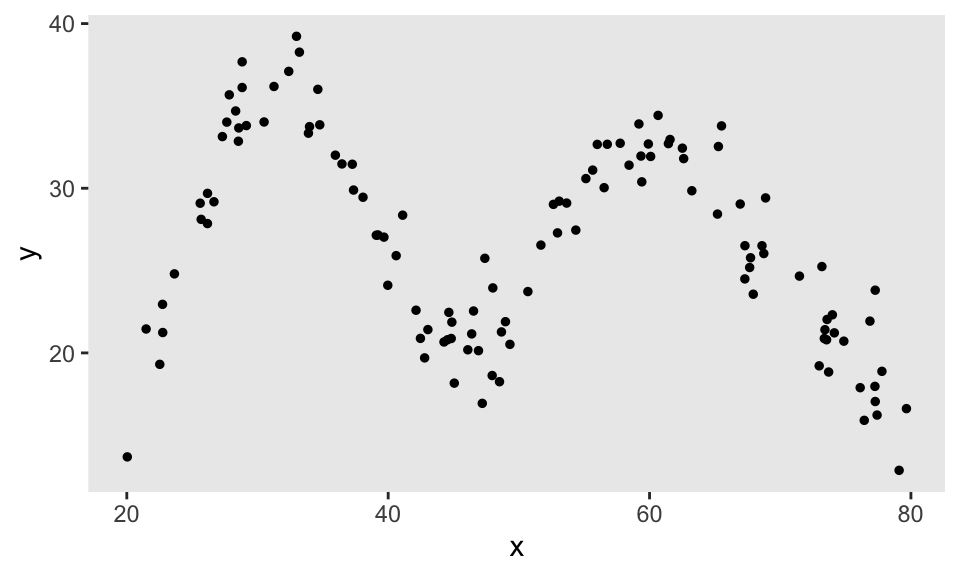
Wrapping all of this up in a function
This can all be simplified by putting the code inside a function; with this, we can generate the desired data in a few simple steps.
Here, we are trying to generated a second curve - this time using six points. The function getNLfunction takes those points, plots the curve, and returns the fitted GAM object.
x <- c(20, 30, 60, 67, 73, 80)
y <- c(15, 42, 42, 67, 67, 30)

nlf <- getNLfunction(data.table(x = x, y = y), k = 1)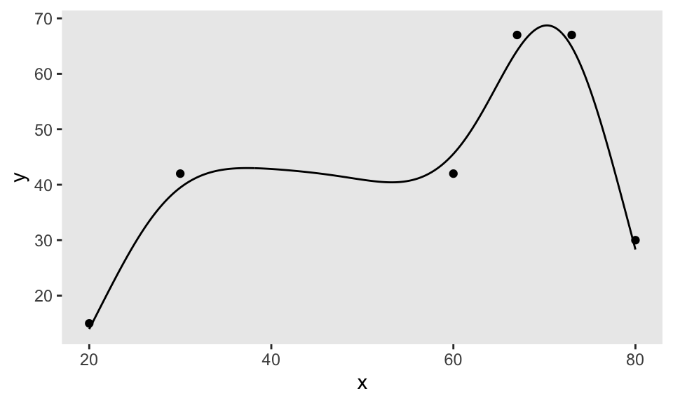
The new function genNL is really just a wrapper for predict.gam. Here, we generate new \(x\)’s and the corresponding \(y\)’s with noise:
rand_data <- data.table(x = runif(180, 20, 80))
rand_data$y <- genNL(nlf, rand_data$x, sd = 2)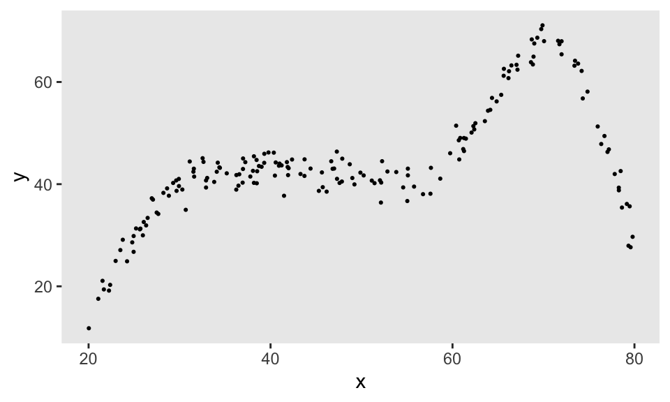
So, with just a few lines of code, it is possible to generate observations from an infinite range of flexible functions. Sometime soon, I will demonstrate how this flexible data generation process can be incorporated directly into a simstudy data generation process.