The package simstudy has some functions that facilitate generating survival data using an underlying Weibull distribution. Originally, I added this to the package because I thought it would be interesting to try to do, and I figured it would be useful for me someday (and hopefully some others, as well). Well, now I am working on a project that involves evaluating at least two survival-type processes that are occurring simultaneously. To get a handle on the analytic models we might use, I’ve started to try to simulate a simplified version of the data that we have.
At some point, I’d like to describe the motivating simulations in more detail. But here, I want to focus more generally on the underlying survival data generating process used in simstudy, looking in particular at how to identify the parameters so that the simulated data will come close to matching a desired distribution.
Generating survival data in simstudy
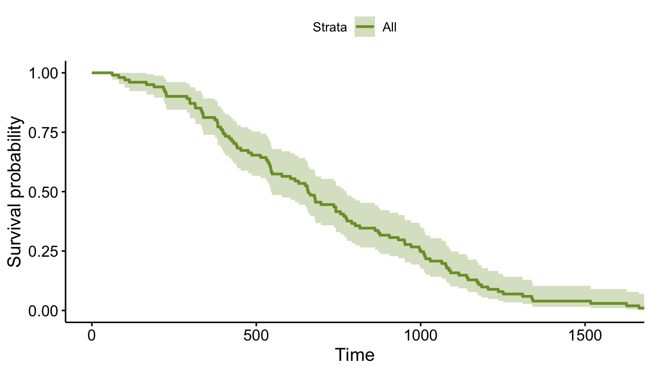
To put all of this in context, this is a simple example of how we can generate survival data using simstudy and then take a look at it using the survival and survminer packages:
library(simstudy)
library(data.table)
library(ggplot2)
library(survminer)
library(survival)

def <- defSurv(varname = "time", formula = -13.7, scale = 1, shape = 0.49)

set.seed(1134)
dd <- genData(101)
dd <- genSurv(dd, def, digits = 0)
dd$status <- 1

dd
## id time status
## 1: 1 604 1
## 2: 2 1012 1
## 3: 3 1338 1
## 4: 4 1009 1
## 5: 5 335 1
## ---
## 97: 97 756 1
## 98: 98 971 1
## 99: 99 381 1
## 100: 100 952 1
## 101: 101 697 1fit <- survfit( Surv(time, status) ~ 1, data = dd )
ggsurvplot(fit, data = dd, palette = "#7D9D33")
So, we have generated survival data, and it all looks great. However, where did those parameters (formula, scale, and shape) in defSurv come from? That’s what we’re focusing on here.
Weibull-Cox proprtional hazard data generation process
This underlying data generating process draws from a Weibull distribution and satisfies the requirements of a Cox proportional hazards model. The approach was drawn directly from this Bender, Augustin, and Blettner paper, so head over there if you really want the details.
The times to survival are generated using three parameters, (scale), (shape), and , which is really from a Cox proportional hazard model that may include a covariate vector . In the examples here, there will only be an intercept.
A single instance is “drawn” from the Weibull distribution by generating from the uniform distribution. It will be the case that of the survival times will fall below the values of determined by ; this will be helpful later when we need to generate data with specific distributions in mind.
It turns out that we don’t really need the scale parameter , because it can be absorbed into , so in all the examples that follow, we’ll set , which leaves us with
Visualizing the survival curves
Weibull distribution data generation is extremely flexible, and can provide an infinite number of distributions of a wide range of shapes. Here are some examples, but first, to get things started, here are two more packages needed to run all the code here:
library(data.table)
library(ggplot2)
The function get_surv generates data for the survival curve. It is deterministic in that it does not generate draws of , but calculates a specific for each value of distribution evenly between 0 and 1.
get_surv <- function(f, shape, n = 100) {

  u <- seq(1, 0.001, length = n)

  dd <- data.table(
    f = f,
    shape = shape,
    T = (-(log(u)/exp(f)))^(shape),
    p = round(1 - cumsum(rep(1/length(u), length(u))), 3)
  )

  return(dd)

}

get_surv(-10, .3, n = 10)
## f shape T p
## 1: -10 0.3 0.00000 0.9
## 2: -10 0.3 10.56988 0.8
## 3: -10 0.3 13.26785 0.7
## 4: -10 0.3 15.31471 0.6
## 5: -10 0.3 17.11875 0.5
## 6: -10 0.3 18.85288 0.4
## 7: -10 0.3 20.64903 0.3
## 8: -10 0.3 22.68619 0.2
## 9: -10 0.3 25.40811 0.1
## 10: -10 0.3 35.86613 0.0Here are 16 arbitrary distributions using four different values of and . Each panel represents a different value of , ranging from 0.16 to 0.22.
f <- c(-26, -27, -28, -29)
shape <- c(0.16, .18, .20, .22)

eg <- expand.grid(f=f, shape=shape)
eg <- asplit(eg, MARGIN = 1)

l <- lapply(eg, function(x) get_surv(x[1], x[2]))
l <- rbindlist(l)

ggplot(data = l, aes(x = T, y = p)) +
  geom_line(aes(group = f, color = factor(f))) +
  ylim(0,1) +
  xlim(0, 800) +
  facet_grid ( ~ shape) +
  theme(panel.grid = element_blank(),
        axis.text = element_text(size = 7.5)) +
  scale_color_manual(
    values = c("#7D9D33", "#CED38C", "#DCC949", "#BCA888", "#CD8862", "#775B24"),
    name = "  f"
  )
Generating a particular distribution
The interpretation of the parameters is a bit opaque. If we have covariates embedded in the coefficients do have pretty clear interpretations as hazard ratios. But the intercept term (remember, I have set ) really defines the scale. So how do we go about selecting values for and to get the desired distribution?
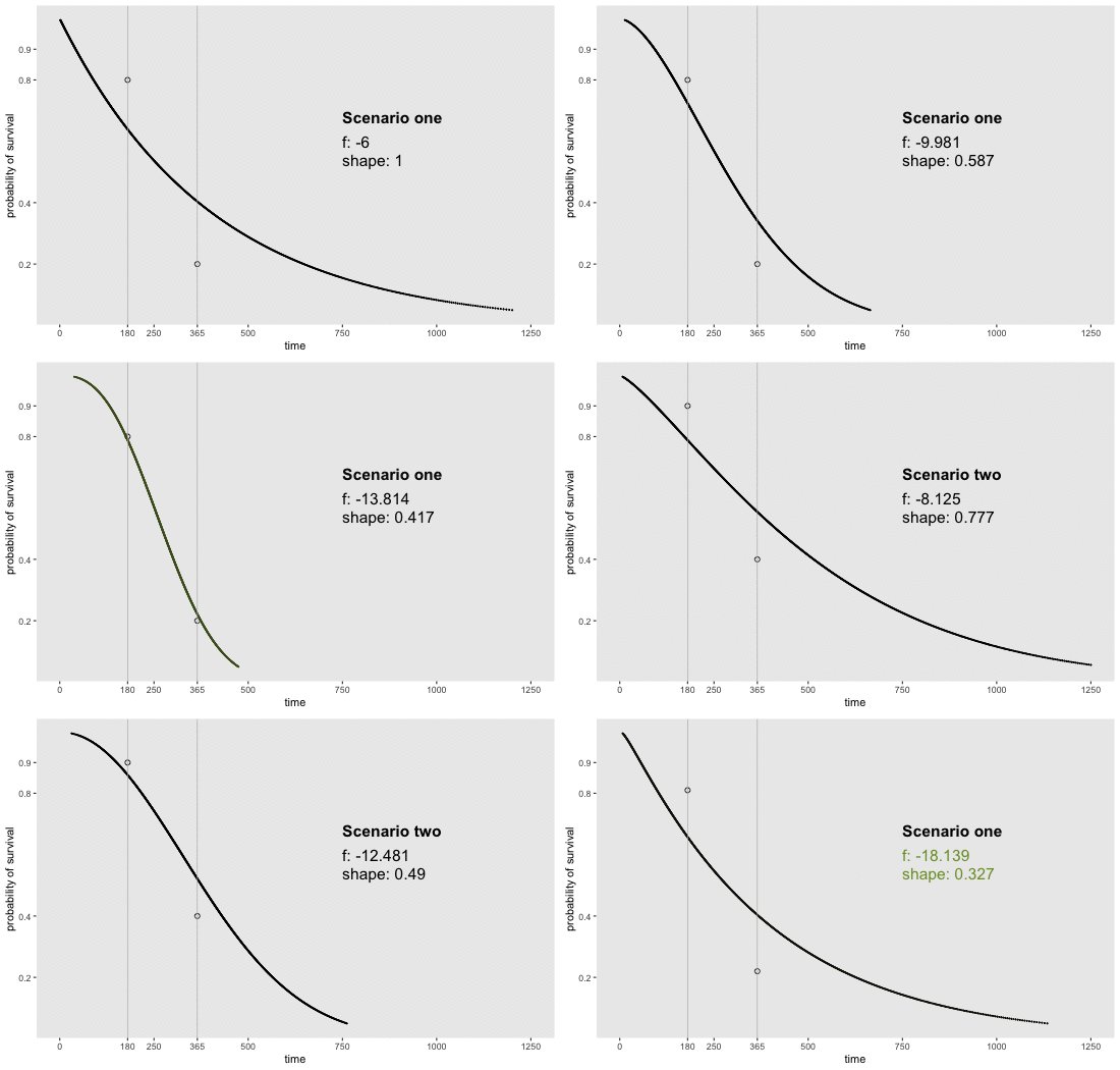
If we can reasonably characterize the desired distribution by two points on the survival curve, the task actually becomes remarkably easy. By this, I mean we pick two time points and a probability of survival for each time point. For example, we may want a distribution with 80% survival until day 180 and 20% survival at day 365. Or, in a second scenario, we may want to have 90% survival at day 180 and 40% survival at day 365. Here is an animation of how we might find the curves by adjusting and (see addendum for code to generate this):

Determining the parameter values
If we have two points in mind, there is an extremely simple analytic solution that can derive and so that we can identify a Weibull-Cox based survival curve that is guaranteed to pass through both points.
For any time point , we have from the equation above
If we have desired points and , then we write can a simple system of two equations with two unknowns, and , the target parameters:
Using simple algebra, we can rearrange terms to provide solutions for and (I’ll spare you the extra steps):
Scenario three
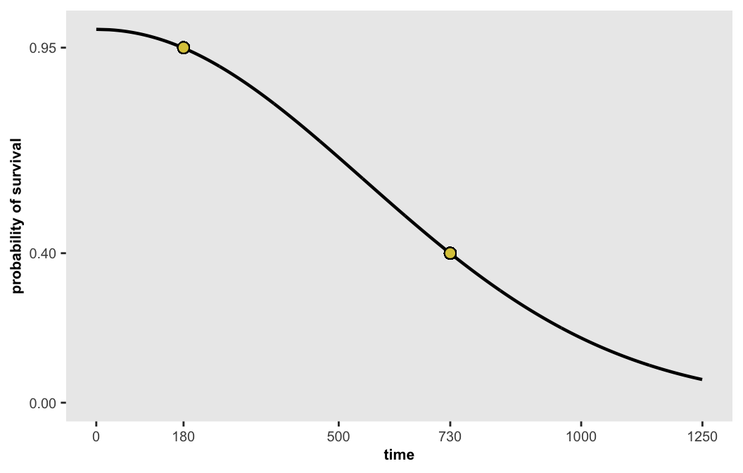
If we want a curve that where there is 95% survival at day 180 and 40% survival at the end of 2 years, the desired parameters are
We can generate points along this curve and then plot them:
dsurv <- get_surv(-13.655, 0.486, n = 1000)
dsurv
## f shape T p
## 1: -13.655 0.486 0.00000 0.999
## 2: -13.655 0.486 26.55994 0.998
## 3: -13.655 0.486 37.20774 0.997
## 4: -13.655 0.486 45.32308 0.996
## 5: -13.655 0.486 52.13693 0.995
## ---
## 996: -13.655 0.486 1714.16472 0.004
## 997: -13.655 0.486 1748.87893 0.003
## 998: -13.655 0.486 1792.58585 0.002
## 999: -13.655 0.486 1852.33947 0.001
## 1000: -13.655 0.486 1950.02084 0.000
Of course, what we really want to do is sample from a distribution defined by these parameters in order to conduct simulation experiments, not just generate and look at deterministic functions. This would include adding covariates and possibly censoring. But all of that remains for another day.
Reference:
Bender, Ralf, Thomas Augustin, and Maria Blettner. “Generating survival times to simulate Cox proportional hazards models.” Statistics in medicine 24, no. 11 (2005): 1713-1723.
Addendum
Here is the code that is used to generate the animated plot, which done with the gganimate package:
library(gganimate)

sdd <- list()

sdd[[1]] <- get_surv(-6,  1, n = 1000)
sdd[[2]] <- get_surv(-7.566, 0.783 , n = 1000)
sdd[[3]] <- get_surv(-9.981, 0.587, n = 1000)
sdd[[4]] <- get_surv(-11.137, 0.521, n = 1000)
sdd[[5]] <- get_surv(-13.814, 0.417, n = 1000)
sdd[[6]] <- get_surv(-16.014, 0.358, n = 1000)
sdd[[7]] <- get_surv(-6,  1, n = 1000)
sdd[[8]] <- get_surv(-8.125, 0.777 , n = 1000)
sdd[[9]] <- get_surv(-10.183, 0.619, n = 1000)
sdd[[10]] <- get_surv(-12.481, 0.490, n = 1000)
sdd[[11]] <- get_surv(-14.595, 0.414, n = 1000)
sdd[[12]] <- get_surv(-18.139, 0.327, n = 1000)

k <- length(sdd)

sdds <- lapply(1:k, function(x) sdd[[x]][ , c("iter", "color") := list(x, "black")])
sdds[[k/2]][, color := "green"]
sdds[[k]][, color := "green"]
sdd <- rbindlist(sdds)

targets <- data.table(iter = 1:k, days1 = rep(180, k), days2 = rep(365, k),
  p1 = rep(c(.8, .9), each = k/2), p2 = rep(c(.2, .4), each = k/2))

dt_anot <- sdd[, .SD[1,], keyby = iter]
dt_anot[iter <= (k/2), targets := 1]
dt_anot[iter > (k/2), targets := 2]
dt_anot[, targets := factor(targets, labels = c("Scenario one", "Scenario two"))]
dt_anot[, color := "black"]
dt_anot[iter == (k/2), color := "green"]
dt_anot[iter == k, color := "green"]

a <- ggplot() +
  geom_point(data = targets, aes(x = days1, y=p1), pch = 1, size = 2) +
  geom_point(data = targets, aes(x = days2, y=p2), pch = 1, size = 2) +
  geom_point(data = sdd, aes(x = T, y = p, group = p, color = color), size = .2) +
  geom_vline(xintercept = c(180, 365), lty = 1, size = .3, color = "grey70") +
  geom_text(x = 750, y = .68, size = 5.5, hjust = "left", fontface = "bold",
            aes(label = targets), data = dt_anot) +
  geom_text(x = 750, y = .6, size = 5.5, hjust = "left",
            aes(label = paste("f:", f), color = color), data = dt_anot) +
  geom_text(x = 750, y = .54, size = 5.5, hjust = "left",
            aes(label = paste("shape:", shape), color = color), data = dt_anot) +
  scale_x_continuous(limits = c(0, 1250),
                     breaks = c(seq(0, 1250, by = 250), 180, 365), name = "time") +
  scale_color_manual(values = c("black","#7D9D33")) +
  scale_y_continuous(limits = c(0.05, 0.995),
                     breaks = c(0.2, 0.4, 0.6, 0.8), name = "probability of survival") +
  theme(panel.grid = element_blank(),
        legend.position = "none") +
  transition_states(iter, state_length = 1, transition_length = 1)

animate(a, duration = 24, fps = 10, height = 350, width = 550)
A note on where the parameters for the animation came from
You may be wondering where the parameters used in the animation come from. I really wanted to generate a series of curves that started at a fair distance from the true value and converged to the right spot. My idea was to use a simple loss function that involved the unknown parameters and , which would be optimized (in this case minimized) at the correct values (the same as those derived above). If I could recover the interim values of optimization algorithm, those would provide a sequence of parameters and curves the converge on the true values.
The loss function is a simple squared loss, which is the sum of the squared loss for both points that define the curve:
This is implemented as function fx, which is to be optimized using function optim. I know this may not be the best optimization option in R, but given that this is quite a simple problem, it should suffice. In the function represents , and represents .
fx <- function(x, p, times) {
  (x[2]*(log(-log(p[1])) - x[1]) - log(times[1])) ^ 2 +
  (x[2]*(log(-log(p[2])) - x[1]) - log(times[2])) ^ 2
}
The optimization provides starting values for and . I chose values of and that would locate the initial curve between the two target points. is constrained to be non-negative (and is unconstrained). The key here is that the trace option is set so that interim values of and are reported. I am not showing the full output here, because it is quite lengthy. I only used four interim values (plus the starting and ending values) to create the animation. The final output includes the values of and that optimize the quadratic loss:
optim(
  par = c(-(log((180+365)/2) - log(-log(.5))), 1),
  fn = fx,
  p = c(.8, .2),
  times = c(180, 365),
  method = "L-BFGS-B",
  lower = c(-Inf, 0),
  upper = c(Inf, Inf),
  control= list(trace = 5)
)
## $par
## [1] -16.0137061 0.3577952
##
## $value
## [1] 1.065948e-13
##
## $counts
## function gradient
## 33 33
##
## $convergence
## [1] 0
##
## $message
## [1] "CONVERGENCE: REL_REDUCTION_OF_F <= FACTR*EPSMCH"Incidentally, our analytic formulas give us