I’m preparing a lecture on simulation for a statistical modeling class, and I plan on describing a couple of cases where simulation is intrinsic to the analytic method rather than as a tool for exploration and planning. MCMC methods used for Bayesian estimation, bootstrapping, and randomization tests all come to mind.
Randomization tests are particularly interesting as an approach to conducting hypothesis tests, because they allow us to avoid making unrealistic assumptions. I’ve written about this before under the rubric of a permutation test. The example I use here is a little a different; truth be told, the real reason I’m sharing is that I came up with a nice little animation to illustrate a simple randomization process. So, even if I decide not to include it in the lecture, at least you’ve seen it.
The goal of a randomization test
In the context of an RCT with treatment and control arms and we want to compare average responses (measured by some outcome ), the standard hypothesis test is framed around a null hypothesis . In this framework, and are the average responses in the population under treatment and control, respectively. For this to be valid, we need to assume that the study sample is representative of the population of interest, that has been randomly selected; for most RCTs, this is a fairly untenable. Participants of studies are typically not randomly drawn from the population, but are more likely to have shown up in a particular setting, been identified for recruitment, and ultimately decided for themselves about participating.
The randomization test makes no assumption about whether the sample is representative. Rather, it asks a question that is limited to the sample at hand, regardless of how it was collected or created. The null hypothesis in the randomization test is that the average response in the sample is unrelated to treatment assignment. If we reject the null hypothesis and conclude treatment assignment mattered in this sample, we can decide to extend this conclusion to the population based on our understanding of the intervention and how the sample relates to this broader population. In the standard hypothesis testing framework, the leap from the sample to the population is baked in; in the context of a randomization test, the generalization is not so obvious.
It is also important to underscore that while the standard hypothesis test makes assumptions about normality (or at least about the validity of the Central Limit Theorem), the randomization test makes no assumptions about the underlying distribution of the outcome data.
Simulated data
To make things a little more interesting, and to to test the importance of the normality assumption, I’m using a data generation process that mixes two populations - Group 1, where the outcome and Group 2, with larger mean and variance: . The treatment effect also differs across the groups. The population (or actually the sample) will be comprised of 70% from Group 1 and 30% from Group 2.
For the purposes of creating the animation, I am generating 1000 observations in total, randomizing 500 to each arm:
library(simstudy)

d1 <- defDataAdd(varname = "Y_1", formula = "0 + 2 * rx",
                 variance = 1, dist = "normal")
d1 <- defDataAdd(d1, varname = "Y_2", formula = "5 + 1 * rx",
                 variance = 4, dist = "normal")
d1 <- defDataAdd(d1, varname = "Y",
                 formula = "Y_1 | 0.7 + Y_2 | 0.3", dist = "mixture")

set.seed(11778)
dd <- genData(1000)
dd <- trtAssign(dd, grpName = "rx")
dd <- addColumns(d1, dd)
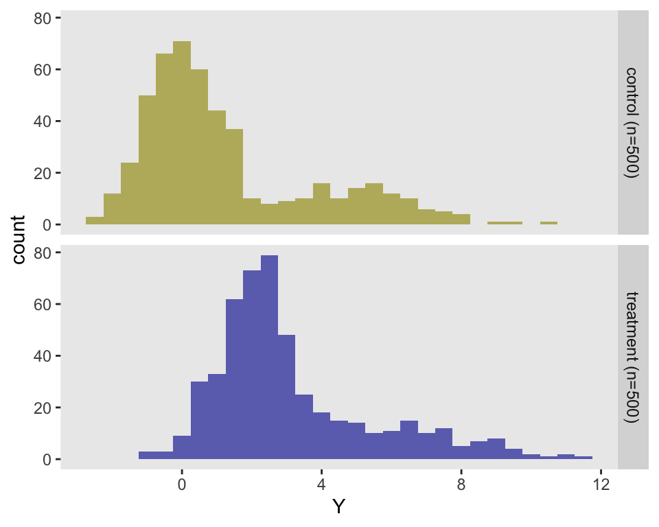
The histogram of these data makes it quite clear that the data are not normally distributed:

Randomization
In the simple case of two-arm trial, the randomization test is quite simple: we repeatedly assign randomly generated alternate treatment arm labels to each of the observations, and calculate the test statistic following each iteration. In this case the test statistic in the difference in means .
In a more complex situation, where the data have an underlying structure, such as clustering or block randomization, we have to make sure that the re-randomization does not violate that structure. For example, in the case of a cluster randomized trial where all individuals within the cluster are in the same intervention arm, the null hypothesis is that cluster-level treatment has no impact, so we would re-randomize the cluster as a whole, not the individuals.
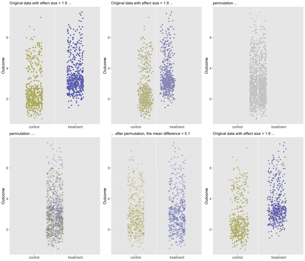
Here is the animation that depicts a single iteration of the re-randomization process, starting with original data, permuting the data, and calculating , the test statistic for iteration of the procedure. In the data just generated and the re-randomized . (The code for the animation is in the addendum.)
dd[, rx_s := sample(rx, replace = FALSE)]
Estimating a p-value
The animation is kind of a cool way to depict single iteration, but to estimate a distribution for and ultimately the p-value, we need to do this repeatedly. Using 1000 observations, the p-value will be vanishingly small, so I’m creating a much smaller data set of 60 observations with an observed effect size of 1.8.
dd <- genData(60)
dd <- trtAssign(dd, grpName = "rx")
dd <- addColumns(d1, dd)

Delta_obs <- dd[rx == 1, mean(Y)] - dd[rx == 0, mean(Y)]
Delta_obs
## [1] 1.809The iteration process consists of repeatedly calling a function that randomly assigns labels and returns the group differences based on these new labels. It is generally recommended to run between 500 and 1500 iterations (including the observed data set, which can be viewed as just another iteration under the null hypothesis); here I am using 1500.
randomize <- function(dx) {

  rx_s <- sample(dx$rx, replace = FALSE)
  dn <- data.table(Y = dx$Y, rx = rx_s)
  Delta_star <- dn[rx == 1, mean(Y)] - dn[rx == 0, mean(Y)]
  Delta_star

}

Delta_stars <- sapply(1:1499, function(x) randomize(dd))
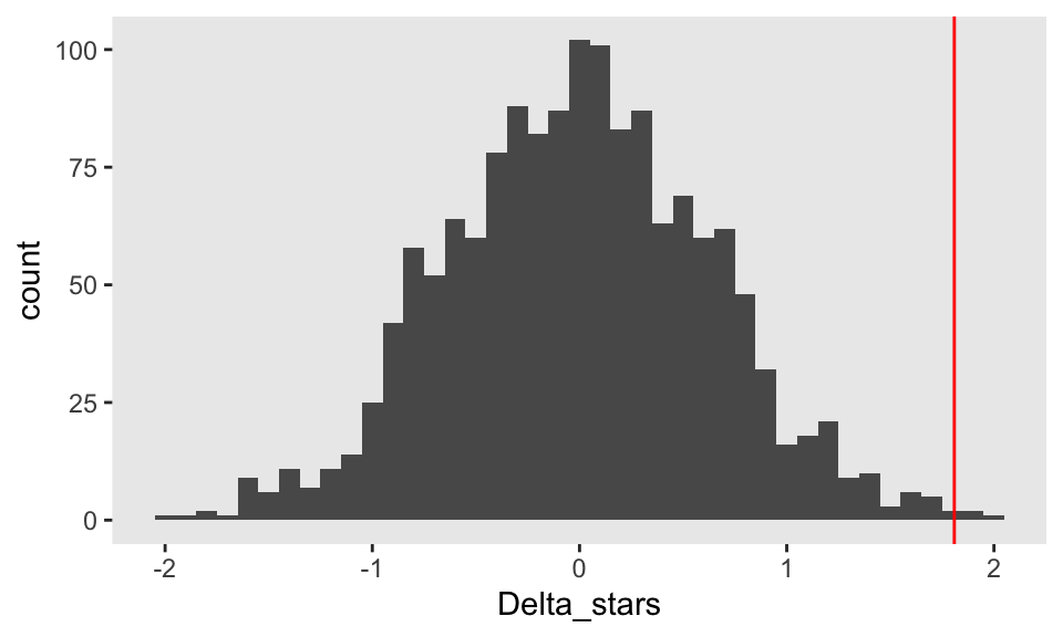
The distribution of the ’s appears to be normally distributed even though the underlying data are not; the red line indicates the observed value, :

The p-value is estimated by comparing with a combined data set that includes the ’s and . Using an , we would reject that null hypothesis and conclude that within this sample, treatment had an effect.
1 - mean(abs(Delta_obs) >= abs(c(Delta_obs, Delta_stars)))## [1] 0.004667Operating characteristics of the randomization test
I was very interested to see what the Type I error rate would be for this example, so I repeatedly generated data sets under the assumption of no treatment effect . For each data set, I estimated both a traditional as well as a randomization test p-value. I used a large number of iterations - 48,000 to be exact - to make sure my Type I error estimate converged as close to as possible to the truth.
This would have taken days, probably close to a week, on my laptop; to get around this I used a high performance computer which I have described in the context of Bayesian modeling. Rather than days, it took about 2 hours. If you’d like the code for this, I’m happy to share. Using datasets with 20 observations, the standard Type I error rate was 4.5% and the error rate using the randomization test was exactly 5.0%. With 40 observations, the error rates were 4.8% and 4.9%, respectively. So it appears that, in these scenarios at least, the randomization test does a slightly better job of realizing the targeted 5% Type I error rate.
Addendum
The animation is created using the gganimate package. This is completely new to me, so I am still exploring; if you want to learn more, I’d recommend checking out the website. The key element is to define a sequence of plots that represent states; gganimate magically creates the necessary transitions, and you can control observation times and smoothness of the transitions. The output is a gif file.
library(ggplot2)
library(gganimate)

dif_in_means_orig <- round(dd[rx == 1, mean(Y)] - dd[rx == 0, mean(Y)], 1)
dif_in_means_perm <- round(dd[rx_s == 1, mean(Y)] - dd[rx_s == 0, mean(Y)], 1)

dd1 <- dd[, .(iter = 1, id=id, rx = rx, rcolor = rx, Y=Y, perm = FALSE)]
dd2 <- dd[, .(iter = 2, id=id, rx = 0.5, rcolor = 3, Y=Y, perm = FALSE)]
dd3 <- dd[, .(iter = 3, id=id, rx = 0.5, rcolor = rx_s, Y=Y, perm = TRUE)]
dd4 <- dd[, .(iter = 4, id=id, rx = rx_s, rcolor = rx_s, Y=Y, perm = TRUE)]

ddx <- rbind(dd1, dd2, dd3, dd4)
ddx[, iter := factor(iter,
  labels = c(
    paste0("Original data with effect size = ", dif_in_means_orig, " ..."),
    "permutation ...",
    "permutation ....",
    paste0("... after permutation, the mean difference = ", dif_in_means_perm)))]

a <- ggplot(data = ddx, aes(x = rx, y = Y, group = id)) +
  geom_point(position = position_jitter(seed = 42),
             aes(color = factor(rcolor), shape = perm)) +
  geom_vline(xintercept = 0.5, color = "white") +
  scale_color_manual(values = c("#bbb66c", "#6c71bb", "grey80")) +
  scale_shape_manual(values = c(19, 4)) +
  scale_x_continuous(limits = c(-.5, 1.5), breaks = c(0, 1),
                     labels = c("control", "treatment")) +
  theme(legend.position = "none",
        panel.grid = element_blank(),
        axis.title.x = element_blank(),
        axis.text = element_text(size = 12),
        axis.title.y = element_text(size = 14)) +
  transition_states(iter, state_length = 2, transition_length = 1) +
  labs(title = "{closest_state}", y="Outcome")

animate(a, duration = 15, fps = 10, height = 450, width = 350)